When we say “good website,” we don’t necessarily just mean a colorful and artsy web design. People like websites not solely because of appearance, but because of functionality as well. When you’re able to blend a good look with a navigable and functioning website, you’ll likely get a site that people will want to visit a lot. How do you do this, though? What exactly makes a web design good? And what does the creative agency branding do?

Table of Contents
1 – A simple concept will likely work to your advantage
When you want to pursue a good website, you’ll likely benefit more with a simple design. A website that’s over-designed will likely overwhelm users, and may not even function properly. A fresh and clean design will grab the attention of viewers, and users might have a delightful time going through your website then they can do their tasks efficiently.
- This has to do with navigation as well. A simple concept allows your users to traverse one part of your website much easier after the next. This not only encourages them to explore the website more but shows they can do business with you easily. Try to follow the “F” pattern, which follows the principles that people like reading left to right and top to bottom. You can adapt your website content to fit this flow.
- Take advantage of white spaces and minimal design. When we say “good and efficient websites,” we don’t just pertain to cute visuals and a lot of features. We also pertain to their placement in the overall system. You can take advantage of white spaces to ensure there’s a good chance of helping your viewers navigate through the website easily.
2 – Match website design elements across your pages
Aside from an overall concept, make sure your website follows a particular “motif” across its pages. Make sure your design elements remain consistent across your pages. These “elements” don’t just mean buttons, headings, fonts, and sizes, though. This also pertains to the placement of your elements, how you want your users to use each page, and how each page “feels.”
- It helps to match visual elements to give your website a semblance of identity. These include picking a good color palette for your site so you can deliver a refreshing and pleasing environment for your visitors. You can use a balanced color palette – preferably just two (2) colors – to maximize your visual potential.
- Aside from visual elements, you can use other elements to your advantage as well. These include not only your colors and shapes but also your typography. Your website needs to be readable in order to gather users and potential customers. This is also ultimately beneficial to SEO. Typography includes the usage of SEO-sensitive things such as metadata, and keywords.
- If this can be confusing, try to put your elements along a grid-based layout. This allows you to arrange things into boxes, columns, and sections that can help make everything feel balanced and lined up.
3 – Ensure compatibility across platforms
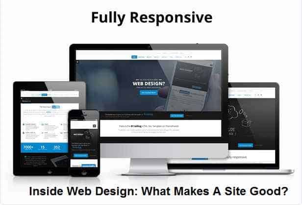
Websites don’t just appear in desktops and laptops, they can appear in other platforms as well. If you want to ensure your visitors don’t leave your site, you can make sure your website can be viewed in other platforms. These include mobile phones and tablets, as these are commonly-used for others as well. Lose this integral element and you’ll likely lose out on a lot of potential conversions.
- When we talk of mobile compatibility, this doesn’t just mean “switching” from one platform to the next. We also talk about operating systems, various graphical features, and how your functions work with all of these. You need to ensure these elements are seamless regardless of the kind of phone or tablet or computer your customers use.
- Compatibility also has to do with loading your website elements. When you bombard your website with too much elements such as CSS, JavaScript, and HTML without compressing them properly, you’ll likely have long loading times that can be very unappealing to your users.
4 – Make sure your website functions exactly as intended
Aside from relying on the visual elements of your site and its compatibility across devices, you need to ensure your website is capable of fulfilling your users’ needs in the first place. A website with an awesome look but with no functionality won’t be useful to anyone. Make sure that when you integrate various design elements in your site that they can fit seamlessly with your website purpose.
- Make sure your website is capable of helping you let people know your expertise and let you build your reputation. This doesn’t just mean having a blog to share your knowledge with people, but the capacity to provide service as well. For instance, a website like Metro By T-Mobile focuses on providing LTE and mobile data for its customers. Its website uses loud but simple design to let people know they cater to modern audiences, and its services are easily accessible from the website.
- On the backend and the business end, you should make sure your website can generate leads, sales, and take care of their customers. This is why a lot of websites tend to link their social media pages to their sites, and have updated Contact Us pages. In the aforementioned Metro By T-Mobile website, it’s easy to check how you can pay your metropcs bill online. Having these pages secure will allow people to communicate with you easily. This can secure their loyalty to you as customers.
Good Web Design: You Need Good Mix Of Visuals, Function
With the tips above, it’s important to remember that good web design has a lot to do with the way you combine your site’s “look” with the overall feel you want the site to have. This goes not just for design, but all the way to website functionality and maintenance. When you get these points hashed out and cleared out with your overall design, you’ll likely have a website people will be loving for years to come.


